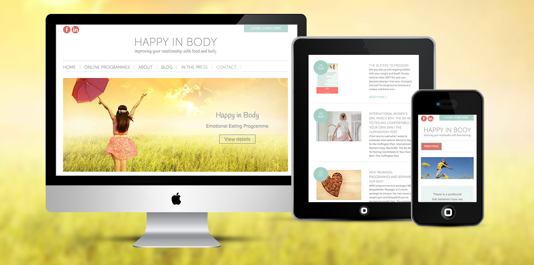
Happy in Body provide online courses in weight loss and healthy eating. Claudia believes that there is a profound link between how we nourish ourselves and how we feel about our bodies. Claudia is a Nutritional Therapist and an Eating Psychology Coach and is absolutely passionate about helping women feel better about themselves – literally be ‘happy in body’. Her approach to weight loss is the opposite of punishment and calorie counting. You get one on one help not only to lose weight but also to make you feel healthier and happier within.
The new online courses website design will create the storefront to the world! Customers should participate – read the blog and sign up/pay for programmes. The site needed to be ‘clean’ with a white background, nothing cluttered – relaxing for the eye to look at. At the same time there should be a slight femininity so women know this is for them (not too much though!). Happy in Body is based in Gibraltar and the aim of the website is to expand her market to the rest of Europe and further.
I chose soft pastel colours to provide a feminine feel for this web design. All of the images also have soft colours to keep the theme going throughout. Custom graphics and buttons were designed to match the colour scheme. Contemporary fonts are used for the main text with hand written fonts used for buttons, titles and quoted text. Fonts are light and modern to create a friendly feel but get down to business where it matters. The background is clean and white and the layout is completely uncluttered. Strong calls to action for the visitor to sign up to online courses and pay online with WordPress and WooCommerce. Photographs were carefully selected from an online photo repository to compliment the look and feel of the website.

