This was a lovely project to work on and if you get the opportunity to work with these guys then do! They are marketing specialists in the Pharmaceutical industry and work alongside medical experts to deliver top grade solutions for their clients, who include GlaxoSmithKline and Novartis.
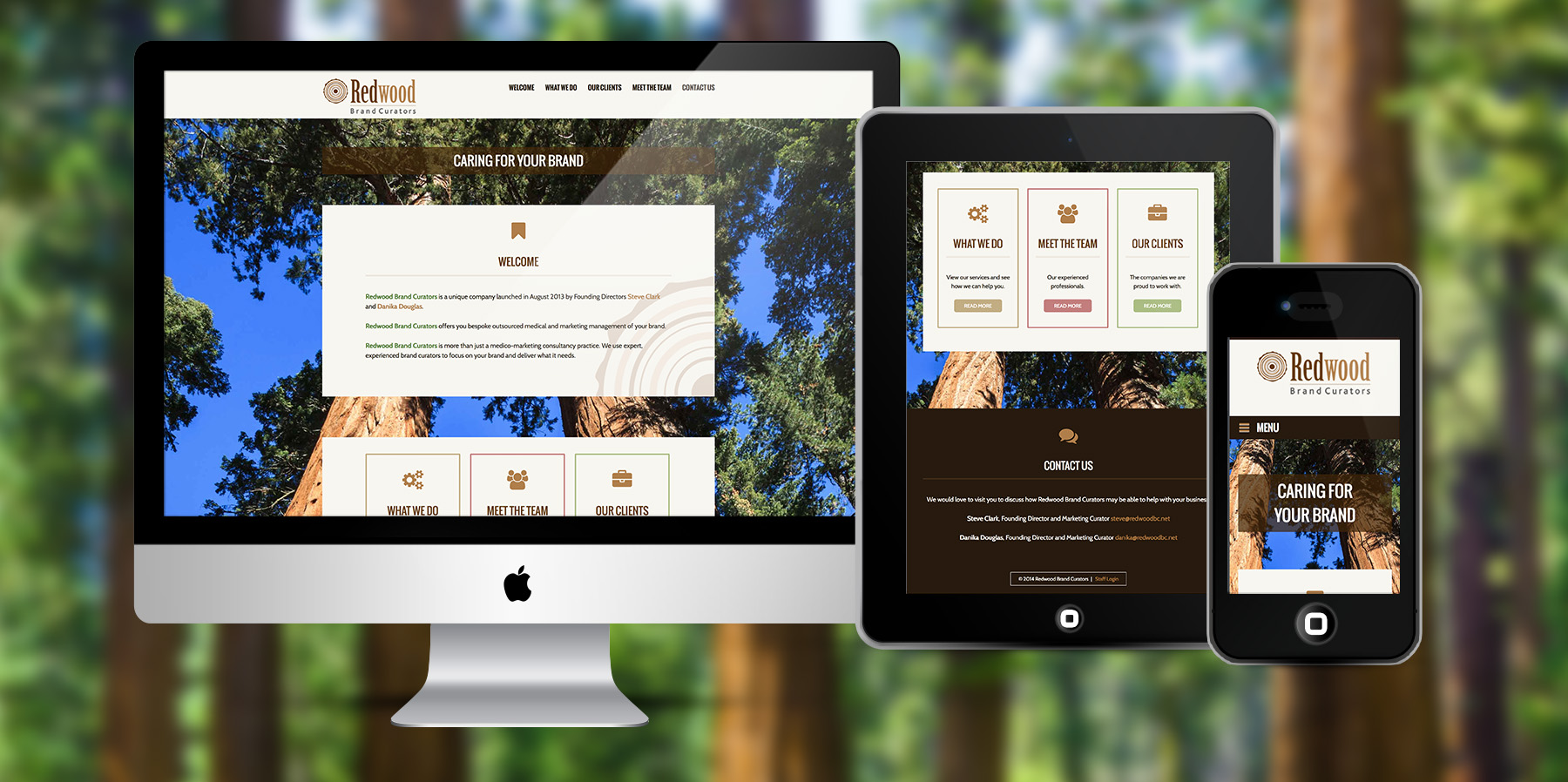
Redwood Brand Curators were looking for a simple but bespoke, web design with a clean and clear message based on a natural design. The trees not only represent their brand but also create the right message. The website objectives were: to encourage potential customers to enquire for more information; to demonstrate tone and business capability; to give existing and potential customers confidence in Redwood as an organisation. The WordPress design keywords were professional, unique, bespoke, reliable, strong and organic (natural). The web design theme was to be organic, the logo being in shades of brown and tan – earthy colours.
I carefully selected images of redwood trees to create the full screen backgrounds, these make a stunning backdrop and really make a statement. The content elements have a cream background with a large semi-opaque version of the logo overlaid. Icons match the branding colours and I introduced a little pink, blue and green in the buttons. Hovering over the sections at the bottom of the home page gives the effect that they are slightly lifting from the page. The header font is Oswald and the body font is Cabin, they work really well together. The dark footer brings the whole thing together with a dark earth colour to ground the site and the branding.
This WordPress Design certainly demonstrates the tone of the organisation and Redwood’s business capability. It demonstrates a strong brand and promotes trust, plus Redwood now stand out nicely from the crowd.

