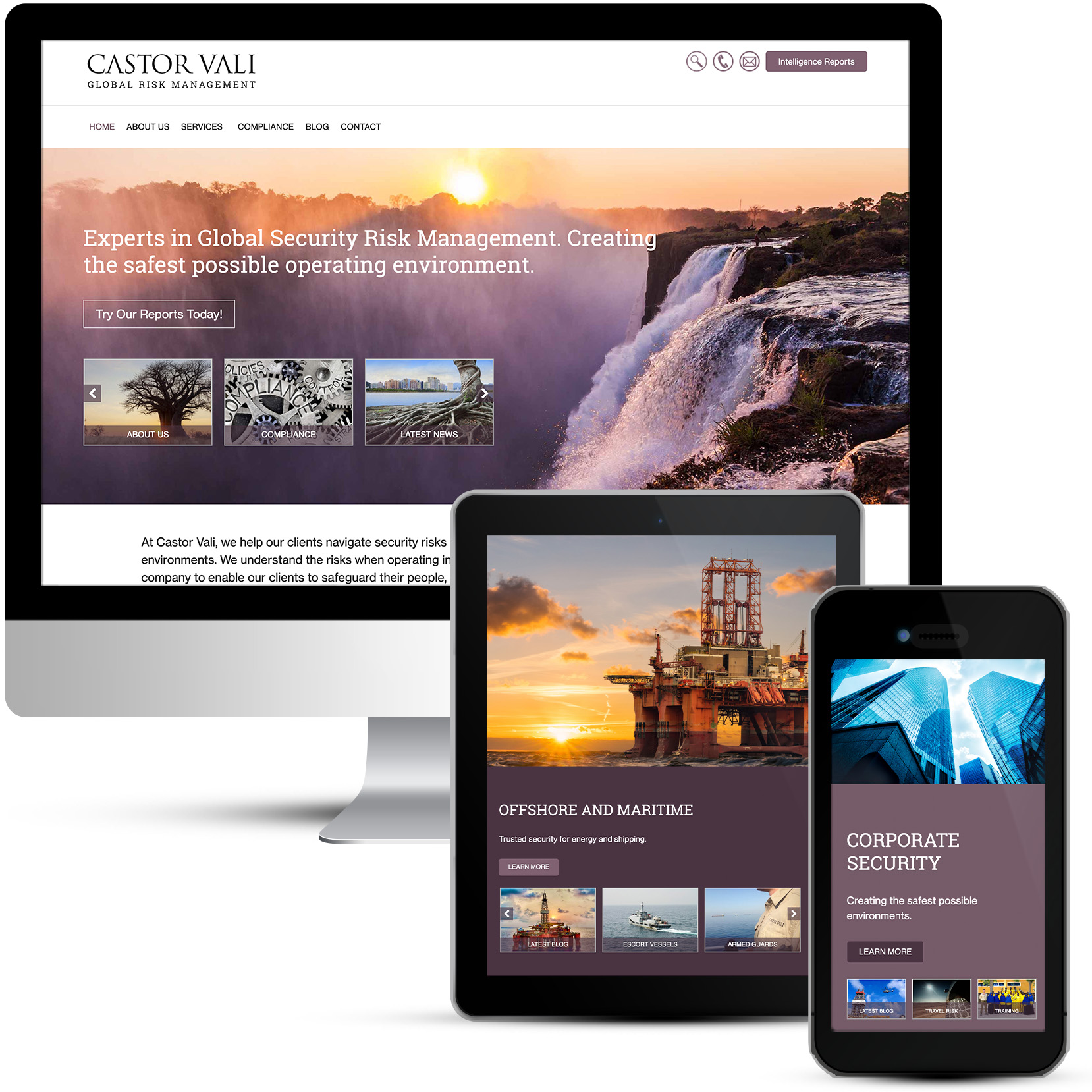
This is a Corporate website design, a brochure style website with blog, document downloads and case studies.
Castor Vali is a Global Security Risk Management company, headquartered in the UK, with a regional (24/7) HQ in Nairobi, Kenya, supported by smaller offices in other African countries. The company was formed by ex-Royal Marine Commandos to deliver maritime security services, before expanding to develop a strong reputation for providing security services to the Oil and Gas extractives sector, both on-shore and off-shore. More recently Castor Vali has also been delivering land-based security risk-management services in Kenya and other African countries. Core services fit into four major areas.
A new website is required. Castor Vali feel that the current website is too dark and no longer accurately represents their services. The layout is too ‘busy’ and text heavy. The language is too ‘UK-military’ for broad appeal.
A clean, sharp look is required to represent an African security risk management company with global reach. Making an effort to appear more accessible to groups who would normally not choose to use these services. It should clearly and concisely communicate the service offering and portray the corporate image and experience. Visually and through narrative visitors should come away with the confidence that Castor Vali know how to support their needs and have done it before.
Without diluting a strong track record in maritime security and in supporting the Energy Extractives Sector, Castor Vali want to widen their appeal, and start to attract clients who might not normally seek the services of companies who appear military in approach. This would include the Development Sector (including NGOs) and families. This strong track record should promote their ability to support wider clients.
A simple and uncluttered homepage should have broad appeal and most importantly, not put any potential decision makers off. Avoiding the colours used by competitors is very important for setting Castor Vali apart from the rest.
At the time it felt like a bit of a brave move choosing Purple and Mauve as the colours for this corporate organisation led by Royal Marines but I am very pleased to say they loved it! It certainly sets them apart from the boring blues and greys that their industry favours and enables them to stand out from the crowd.
A brand new clean and contemporary web design was created. The website uses bold imagery and the theme is Sunrise, safe and sound the night is over and all is well. Conveying the message that this is a security company you can trust. This website needs to appeal to women just as much as men and building trust with images is a good start. The home page is not cluttered with text and the rest of the website follows suit, with small blocks of text very well punctuated with images. The Roboto Slab logo is used throughout, including the main navigation. The capitalized version of this font exactly matches their logo font, equally it is easy on the eye as a body font.

