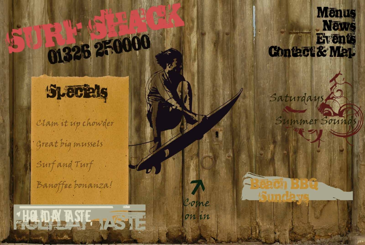
In my spare time I have been going through my old files and archiving them. I found lots of things that made me smile and this was one of them. It’s one of my very first web designs!
This is a composition that I created for a cafe bar or surf shop, it’s a grunge style comp that was one of my designs for my degree module. I decided to keep it here in my blog to demonstrate a little design flare and to show that I am not restricted to contemporary business websites!

How I did it
The wood panel background is an image from a stock image company. It is actually an old barn door so came ready with the handle to invite people to come in. I had to do a fair bit of hunting around but it was worth it. I wanted to create a shop front with a bit of mystery to make people want to see what was behind the door.
I chose the grunge style font because it works very well for this type of web design, particularly when used with the other hand-written script.
The image of the surfer on the board came from an online image repository and I overlaid it onto my design. The other background colour effects were created in Photoshop including the ripped paper background on the menu.
In Summary
I have moved more towards crisp, clean and contemporary web design because that is what my clients want and I love that. All the same for the right kind of company in the right market, this could still work well. It might be a bit complex to convert it to a mobile responsive design but I like a challenge.
Bit of an indulgence on my part to post it but it seemed a shame to leave it hidden away in the archives.
