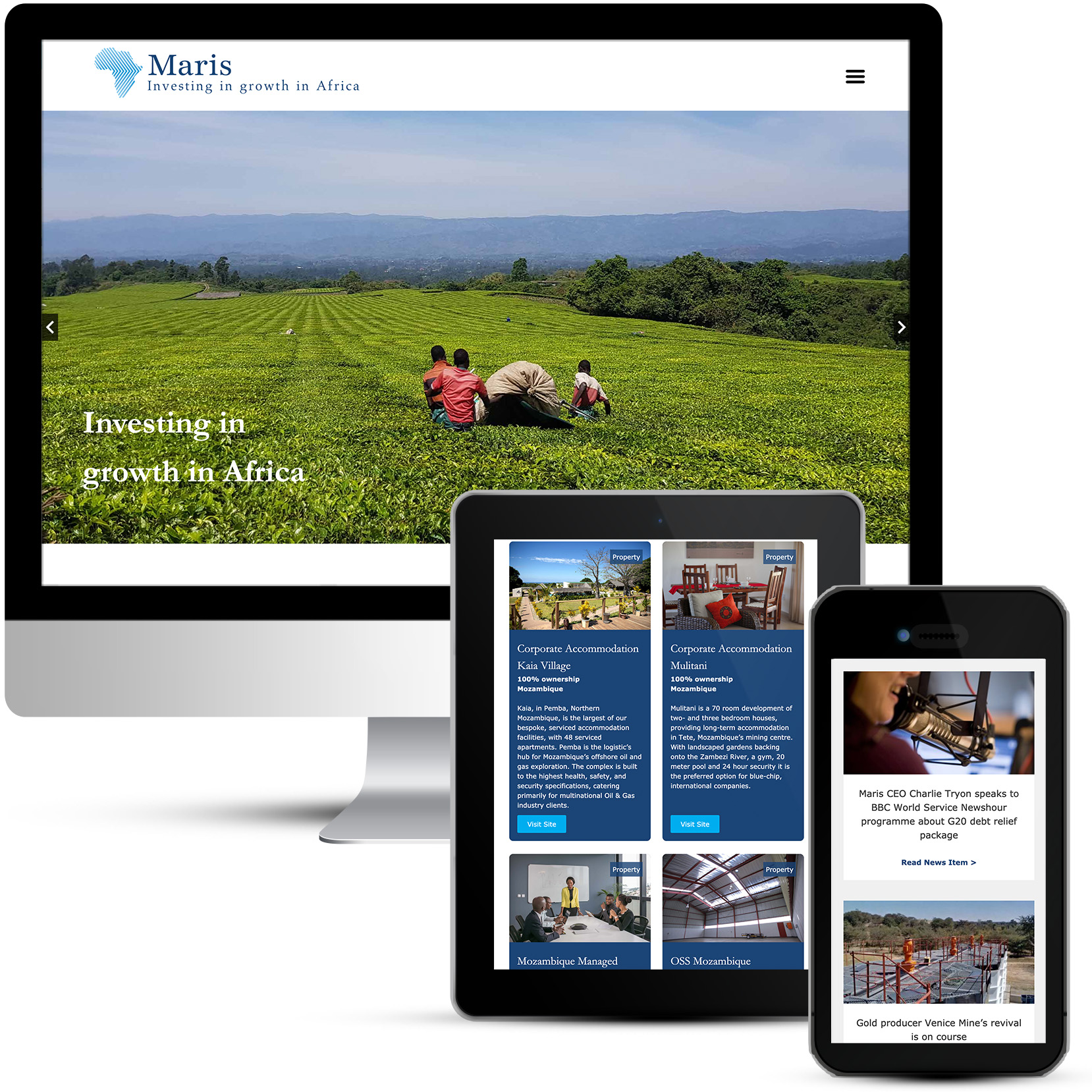
Maris is a diversified investment holding company, committed to responsible, long-term growth in Africa. Maris offers investors unique access to frontier markets across the world’s fastest-growing continent.
Their website didn’t work properly and was difficult to manage and update.
Maris needed a website that worked on PC, tablet and smartphone with none of the existing glitches or bugs. The website to be designed on an appropriate software package that allows for straightforward content editing but robust enough for growth and increased activity over the next 5 years. Site to link in with all of the Maris social media accounts, as well as well as other Maris Group websites.
There were a number of specific design elements that needed addressing:
- Look needs to be modernised and less off-the-shelf / template.
- Menu fonts need to be bigger.
- All images and videos need to be of good quality, or at least edited or modified to look better.
- Where click boxes are used they need to be more stylish – not just big rectangular boxes.
- Improve footers and social media icons – on the current site these look very budget.
- Design of board & division pages need improvement.
- About us / management teams need to be fully responsive and perhaps a redesign, especially management teams.
A brand new contemporary website to exactly meet the required brief. New galleries and grid layouts to ensure that content is clear and easy to navigate.
Using a hamburger menu instead of the standard horizontal navigation ensures that all items can fit in the menu correctly with larger text.
Images are all good quality and automatically cropped to fit the spaces when they are uploaded. Stylish click boxes engage the visitors.
The management teams pages were structured into regions where visitors can drill down to the individuals.

