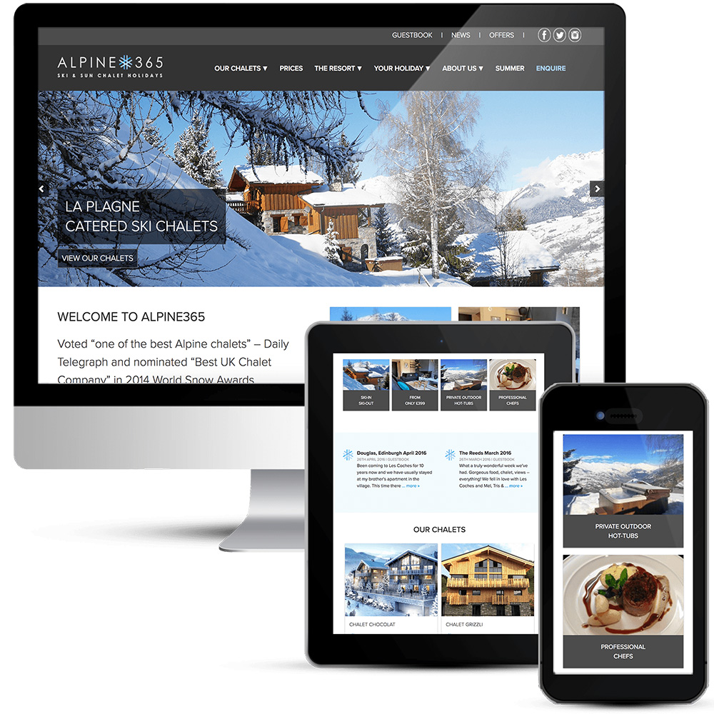
Award winning ski chatlets, voted ‘one of the best Alpine chalets‘ – Daily Telegraph and nominated ‘Best UK Chalet Company‘ in 2014 World Snow Awards, Alpine365 have plenty to shout about. They have four catered ski chalets in Les Coches and Montchavin, La Plagne – in the Paradiski area of France, comprised of the combined resorts of Les Arcs & La Plagne. They offer asy access to 425kms of piste in a single lift pass. Chalets are ski-in/ski-out, located on the piste or right by a lift, and offer a luxurious blend of alpine charm and contemporary style, luxury hot tubs and all mod-cons. Alpine365 only employ restaurant-trained, professional chefs so you can expect exquisitely presented, four-course gourmet dinners served with excellent wines.
The current website is 9 years old, based on old technology and feels dated; there is an immediate need to modernise and become mobile friendly. Equally, the current page layouts are not wide enough and content is crammed into a narrow space. Chalet pages need to display the whole view and be more comprehensive. Galleries need to be brought into the chalet pages, not separate as they are now. The news section needs to work more as a blog including news, media and testimonials.
Apline365 want to move away from the current light blue/orange theme – simply so it feels fresh and new to them! They need to ensure that the content is still clearly visible – sometimes websites focus so much on large images that take up the entire screen and they did not want that. Images are key but so is the need to communicate text/offers/call to action etc on home page.
Design keywords:
- Simple/clean/professional
- Modern/stylish – but not overly “cool”
- Sophisticated
- High quality – but not overly “premium”, still accessible
Holiday rental website design needs to be a showcase for the holiday properties and provide plenty of detailed information. The design is based around the new logo, blending the colours from that into the theme and using the snowflake as an icon throughout the website. The font family is Proxima by adobe, which is contemporary, easy to read and works well with the branding.
The property listings include a carousel gallery at the top, which shows off the property but does not take over the page. Tabbed content enables the visitor to select what they want to read or look at, including location maps but ensures that they are not overwhelmed with content. The home page has a showcase gallery, not too tall so as to keep the content below visible. Alpine365 can also create their own rotating images and use them in any page or post they choose. In other pages I have used Accordion style sliders to display the content that the visitor wants to look at, this stops them from having to wade through lots of text heavy content. Lots of clickable images and quick links keep the visitor engaged and provide a secondary level of navigation. The main navigation is a drop-down menu on large screens with a slide out multi-level mobile hamburger menu. The pricing page includes an easy to see availability table. The contact page offers a single form with multiple choice options so the vistior can choose to make a booking, send a standard message or apply for a job. The blog includes news items, media and testimonials and there are social media links and social media sharing throughout the website.
This is a brochure style website that is completely mobile friendly, so looks great on all devices. The WordPress content mangement system enables the client to update pages and properties and add blog posts as required.

