Responsive web design is essential today, we don’t build anything else. Particularly as Google has started to use the mobile version of the web as their primary search engine index. Known as the ‘mobile-first index’.
Adapting for all devices and browsers gives your users the best experience. Google reports on its blog that 61% of visitors leave a website it if is not mobile ready and responsive web design is best practice.
The main thing is that you deliver the same content via mobile as you do via desktop. Quick page load times are vital, visitors are on the move and need information immediately. Not only that, statistics show that visitors will not wait longer than 3 seconds for a website to load on a mobile, so time really is money.
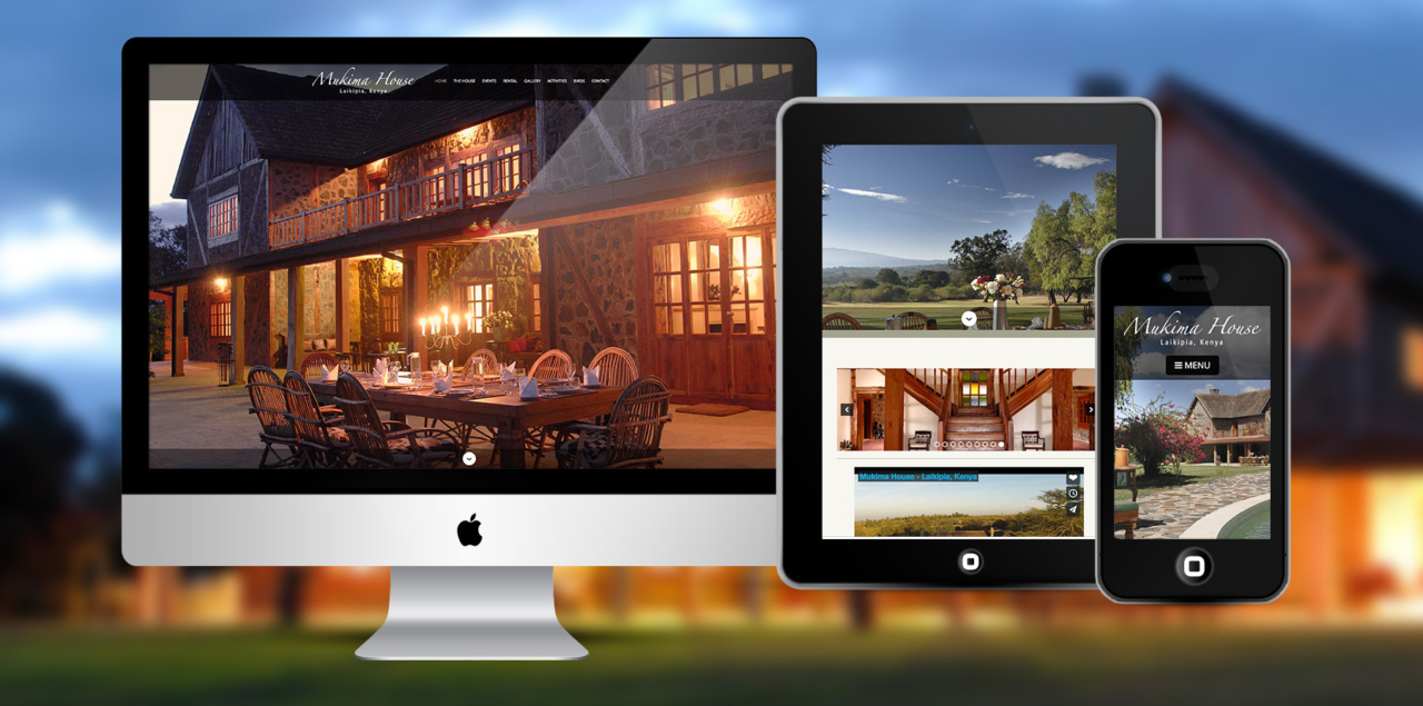
With Responsive Design we adapt our website designs for device types and screen sizes. It’s a bit like pouring liquid into a glass, adapting to fit the container.
Menus need to be adapted to be usable on mobile an example of this would be the hamburger style click button. Other buttons must be easy to use with enough finger space around them. Everything must function on touch screens.
Having done all of that it needs to look gorgeous and persuade your visitors to take the action that you want them to!
