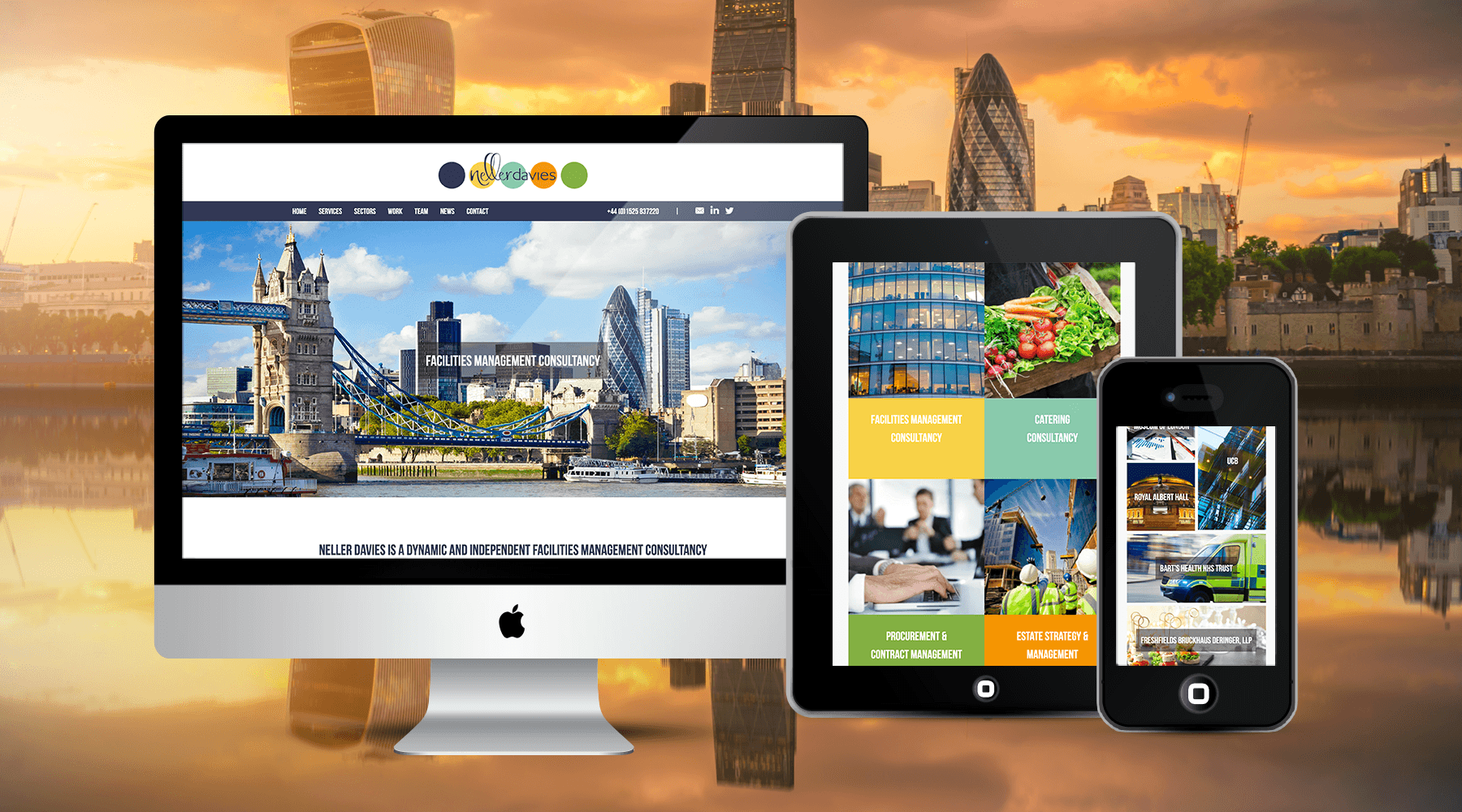
Neller Davies is a young, vibrant and independent facilities management consultancy. They specialise in innovative strategic, tactical and operational facility management solutions. They work across the UK, including London, Birmingham, and Manchester. Clients are as diverse as the assignments they undertake; from large multi-nationals to smaller organisations; NHS trusts through to large government bodies. Whether in the public or private sector, large or small – as a Neller Davies client you will receive an exceptional and consistent standard of service of which they are proud.
The primary audience are senior corporate individuals often working at Board level or as part of a senior management team. They tend to be professionals aged between 35-50. They work hard and full time (plus some), they often have complex agendas and heaving priority piles across a broad range of subjects. If they are on social media, they tend to be most active on Linked In and sometimes Twitter. They engage with straightforward communication and professional language.
21% of the business over the last 10 years has started with an initial google search. As Neller Davies have become more established the proportion of business has increased within the network / referral category however the website still plays a large part in converting recommendations.
The main objective for the website is to accurately convey who Neller Davies are and what they do. It should represent the fact that they are a thought leader in their field. It should rank well on Google.
This is a custom website design built on the WordPress platform. As a freelance web designer I don’t get to choose the branding and it can be a challenge. This however, was a great logo to work with as it gave so many colour options. I have used the colours prolifically throughout the design in colour blocks, text highlighting, buttons and graphics. I used the little ‘N’ icon lots throughout the website design too, to enforce the brand. Image are overlaid with text, clickable to encourage people to venture further into the website. There is lots of image navigation throughout the website. Case studies and blog posts are laid out in grid format and the individual items have an easy to read, well laid out format. The website is of course Google friendly and mobile responsive. Built on WordPress it is very easy to update content as required.

