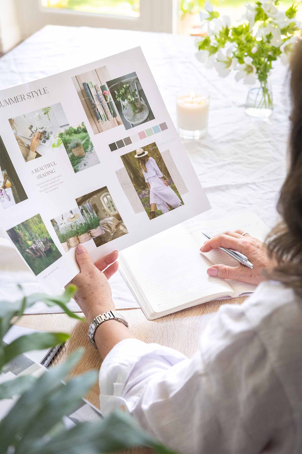
Welcome to our journal, it’s lovely to have you here! Posts are divided up into categories to make things easier to navigate, these include web design insights, WordPress, happy clients, design projects and beyond the studio (snippets of life outside of work). Grab a cuppa and peruse at your leisure!
Everything I do is built on a foundation of kindness and integrity, underpinned with a genuine desire to see you succeed.
I have an absolute passion for creating exceptional websites for small ambitious lifestyle, leisure and creative brands. From boutique holidays to the wedding sector to delightful artisan businesses. My mission is to empower you to feel incredibly confident and bold about what you are offering and how you package and position yourself in the world. I do this through intelligent, deliberate and delightful design that engages your dream clients and works hard for your business.
I’m all about service with a smile and a warm welcome, so you will always feel listened to, understood, highly valued and supported. After all my greatest joy is to watch your business thrive, its the best feeling ever!
I provide clients with absolute peace of mind. I am utterly dependable and provide top notch customer service, always going the extra mile with lightening fast responses. I love exceeding expectations!
You’ll notice the difference from the very first moment you speak with me.

This website uses cookies to ensure you get the best experience on our website. Learn more »